For the fourth year in a row, Brandcenter has partnered with the University of Richmond’s Bench Top Innovations program—a year-long course where students take a food or beverage concept from ideation to commercialization. This unique collaboration brings together University of Richmond (UR) students, who develop the product and marketing strategy, and Brandcenter students, who craft the branding and visual identity under the guidance of faculty member and creative director KT Schaeffer.
Each fall, UR students split into teams to develop competing product ideas, culminating in their annual Bake Off, where one concept is selected to move forward. This year’s theme: coffee.
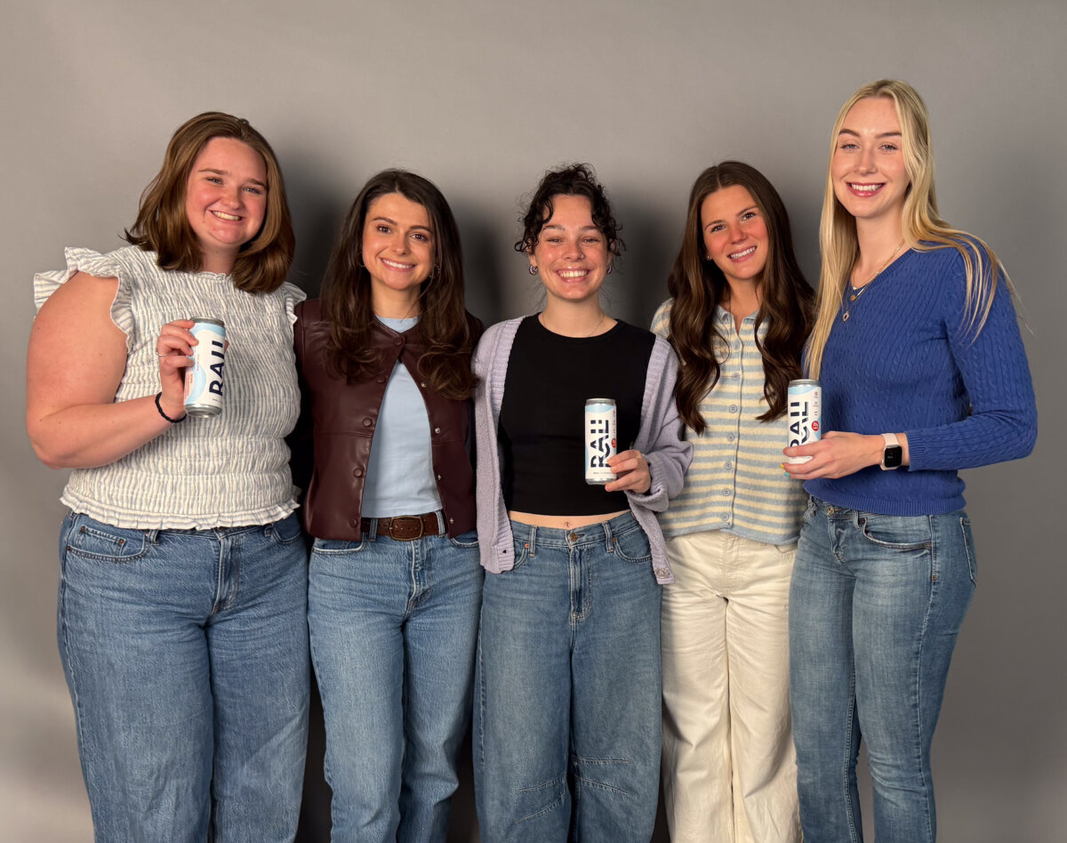
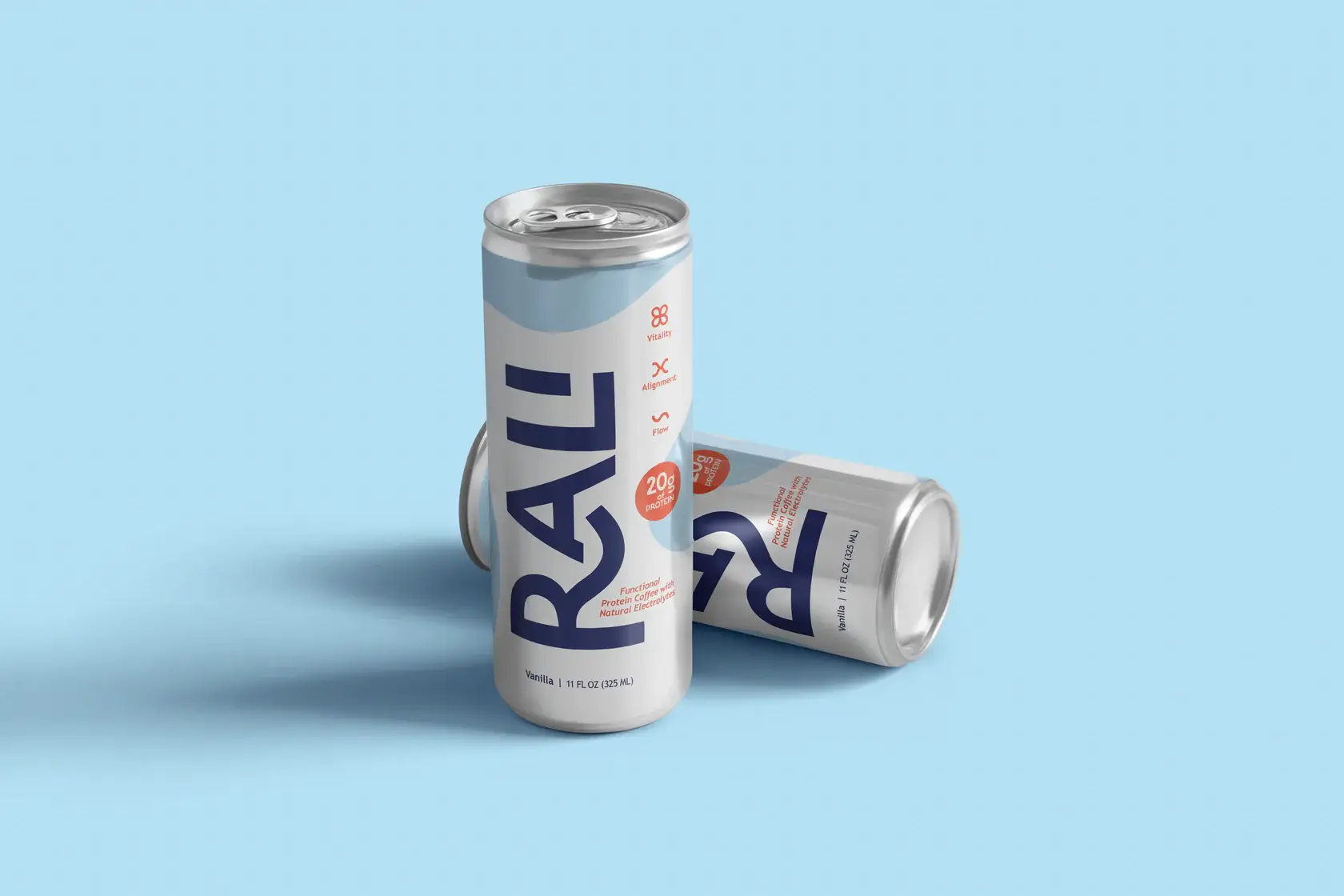
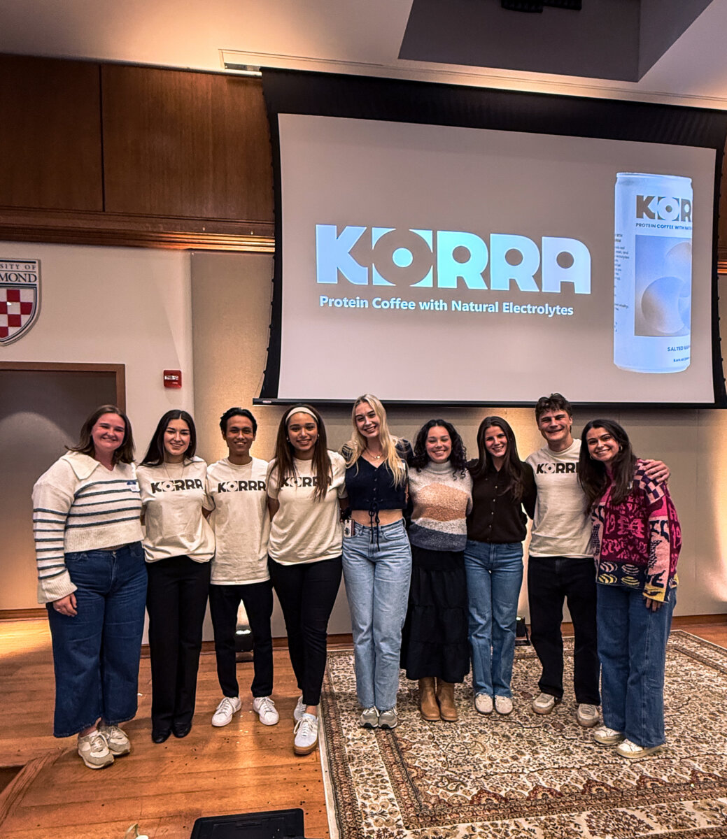
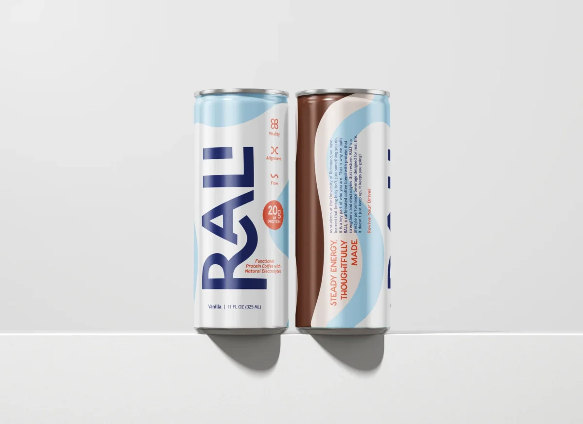
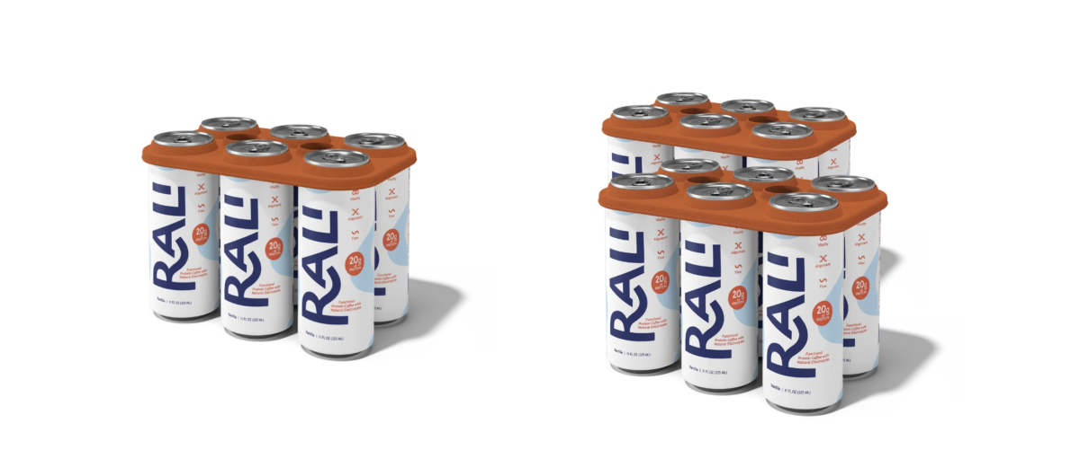
The winning beverage, KORRA, was selected last fall and is now heading to shelves with a new name and look: introducing RALI, a blended coffee beverage with 20g of protein and natural electrolytes, designed for busy adults looking to get caffeine, protein, and hydration in one convenient serving.
Brandcenter students Izzy Pinson (Art Direction, 2026), Eliza Friel (Copywriting, 2026), Erin Romness (Creative Brand Management, 2026), Libby Browder (Creative Brand Management, 2026), and Meredith Moore (Experience Design, 2026) led the branding for RALI.
Building a Brand Around Balance
In shaping the brand direction, the team saw an opportunity to stand out in the market. While many energy and protein drinks lean into intensity, they saw space to emphasize sustained energy and mood.
“Most energy and/or protein products push extremes, more caffeine, more intensity. We saw a gap for something more sustainable, people don’t just want energy, they want control over how they feel throughout the day,” said Copywriter Eliza Friel.
Grounded in that insight, the team developed two distinct positioning territories to present to the University of Richmond team.
They created personas and mood boards for two directions, “The Optimizer” and “The Harmonizer.” The UR students ultimately selected The Harmonizer, a positioning centered on balance and sustained energy, which became the foundation for the brand’s visual identity and narrative.
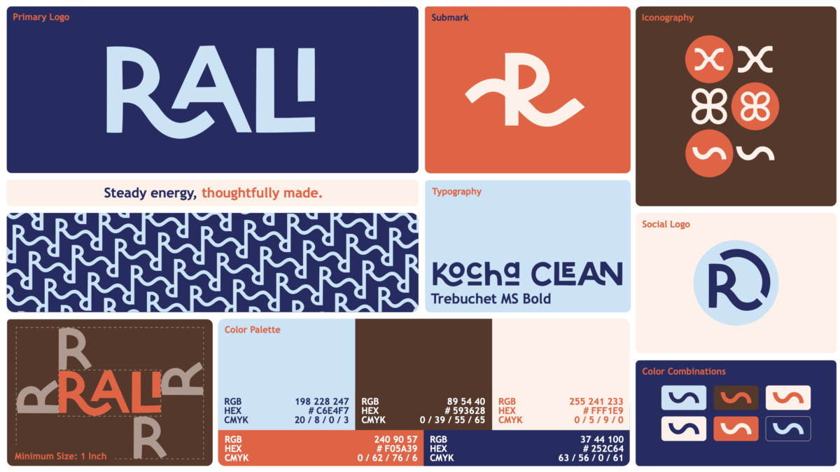
From there, the concept evolved into a clear set of guiding principles. Calm energy and rhythm became central to the brand, expressed through the pillars “Vitality,” “Alignment,” and “Flow,” representing the combined benefits of caffeine, protein, and electrolytes.
From Strategy to Shelf
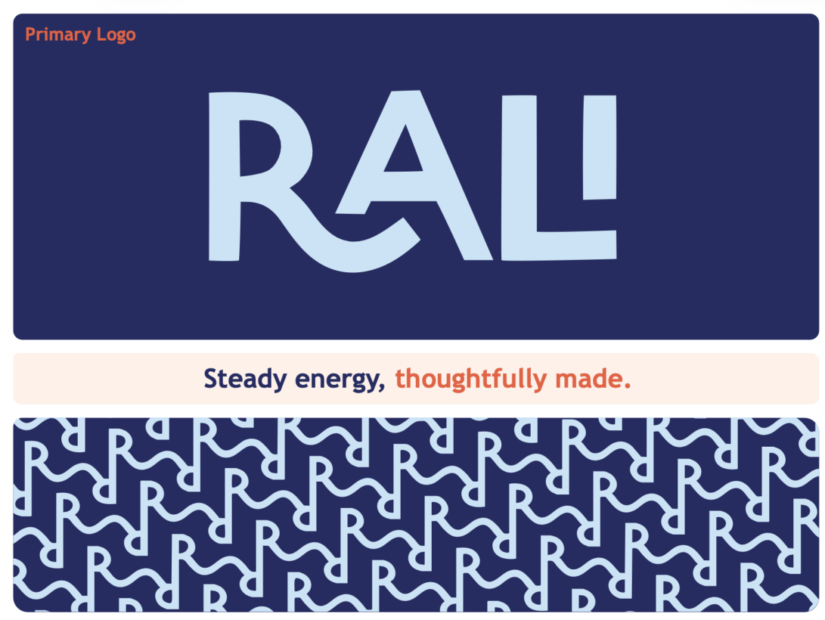
That sense of balance carries directly into the visual identity. The brand’s system leans into minimal, modern typography, curved lines that suggest movement, and a color palette that feels grounded with moments of energy.
Behind that simplicity, however, was a fast-moving and highly iterative creative process.
Art Director Izzy Pinson describes how the team established a strong creative foundation, “Early on, we aligned on five core adjectives to guide the brand: grounded, energized, intentional, refreshing, and confident. Those became our creative guardrails and helped us maintain a clear point of view throughout.”
From there, the team explored before narrowing in.
“At one point, we had around 17 different can designs in play. We wanted to push the creative while still staying anchored in those core traits,” Izzy adds.
Collaboration Across Disciplines
Working alongside students from the University of Richmond meant navigating different perspectives and learning how to translate ideas across disciplines.
For Creative Brand Manager Erin Romness, that collaboration felt both dynamic and familiar.
“Working with the UR students was awesome. Going into the Bake Off, they already had a clear sense of what they were looking for, but were still super open to pushing ideas further, which made the whole process really collaborative.” Erin adds, “Working with other people in different disciplines, even those that don’t have a marketing or design background was cool, because we got different perspectives. It was great practice for working with clients.”
At the same time, those differing perspectives pushed the work in new directions.
“Collaborating with the University of Richmond team, one of the biggest surprises was how differently they approached things. While we approached the project from an advertising and brand perspective, they brought a fresh marketing focused lens. They emphasized making the name instantly memorable, something simple where you can say, ‘Grab me a RALI.’ They also suggested bold and unexpected color choices, like blue and orange.” Eliza said.
Real-World Stakes and Rewards
Many Brandcenter projects are categorized as “speculative work,” where the big picture idea, creative, strategy, planning and branding are the focus, and the pieces are not implemented in reality. A project like RALI came with the real constraints and pivots of bringing a product to market.
For Erin, the process underscored just how much planning goes into the process. She says “My biggest takeaway is how important communication and coordination is when it comes to developing a product, especially when we have to pivot from KORRA to RALI. It was a tight timeline, but it was awesome to see it all come together.”
Eliza adds, “My biggest takeaway is how much goes into turning a concept into a real product. From countless revisions and branding changes, to refining ingredients and navigating legal hurdles, I learned what it truly takes to bring something to market.”
Finding the product on shelves is rewarding too.
“Seeing RALI on the shelves is so surreal,” says Erin.
“What I’m most proud of is seeing something I worked on actually on store shelves. It’s incredibly rewarding to have a product out there that carries the mark of our creativity and effort,” shares Eliza.
The Brandcenter Experience
Projects like RALI reflect what makes the Brandcenter experience distinct: we offer opportunities to collaborate with live clients on projects that can result in outcomes beyond the classroom.
Brandcenter trains students to think critically and form strong opinions, while also staying open to collaboration.
“We’re used to moving quickly and making strong decisions with limited time,” Izzy declares. “Brandcenter really trains you to have a point of view and defend it, while still being open to feedback.”
For Creative Brand Management students, that also means bridging business and creative thinking.
“The Creative Brand Management track at Brandcenter prepares us well for being the translator between business goals and creative decisions,” explains Creative Brand Manager Libby Browder. “As you get to know your clients better, you learn their personal preferences and styles, and know how to communicate effectively to make sure they are happy with the end result.”
KT Schaeffer, Professor of Creative and Creative Director, guided the team every step of the way.
“KT was a huge help, and we could not have done it without her. From the beginning, she guided Erin and me with her industry expertise and guidance as our Creative Director, “ says Libby.
Izzy explains, “KT was a huge part of making this project what it was…She was incredibly thoughtful in how she guided us, stepping in with really sharp, specific feedback, but also giving us the space to explore and own the work. She elevated the entire process.”
You can find RALI at local stores and purchase on their site.